|
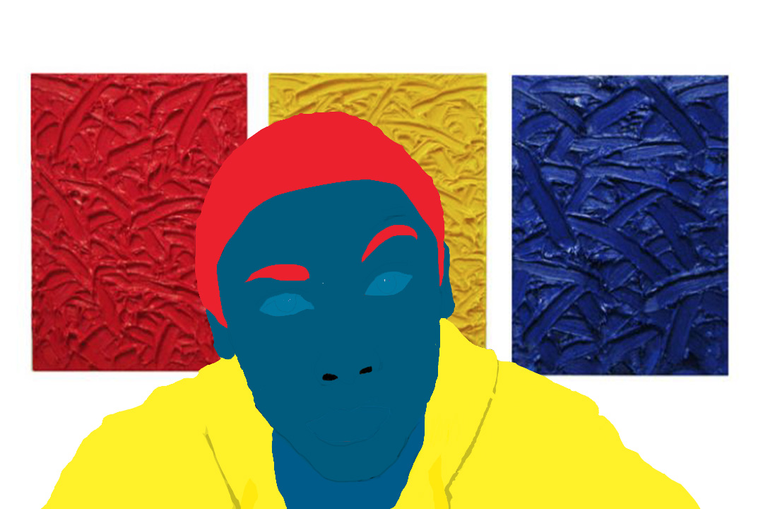
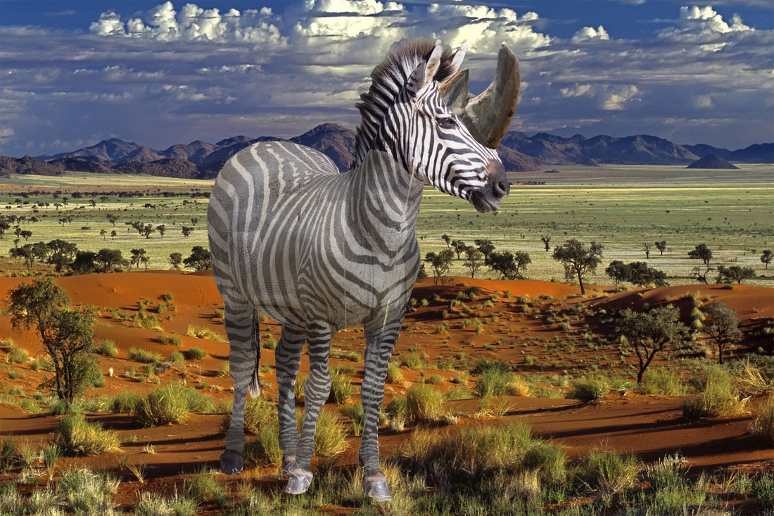
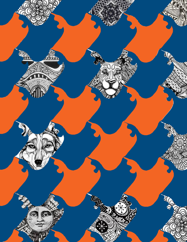
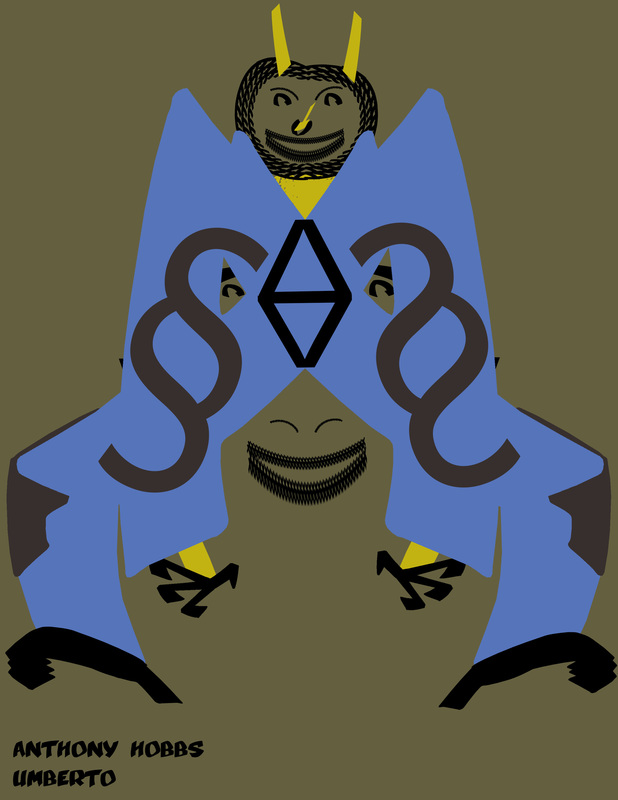
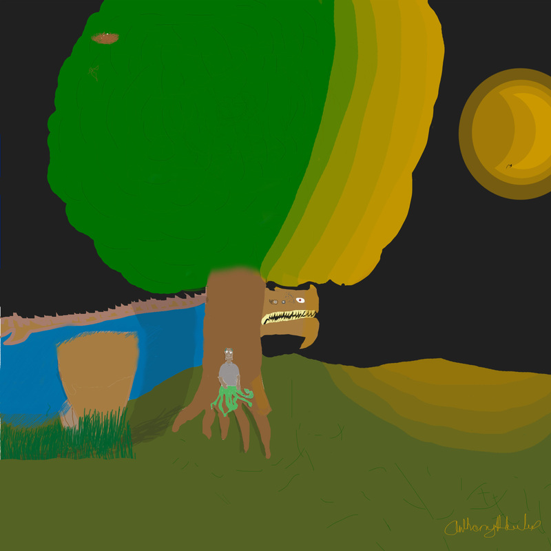
I really enjoyed making this game. It really didn't take long to finish its just that it took a while to add everything. If we had more time we would have made one or two more levels like a Jungle Level and then possibly a Cave. I was really happy when Mrs.Jones said she would publish our game if we added a few more things. When she does I'll add a link to the game HERE and if you already have Game Maker you can download the game HERE(coming soon). The people who were a part of this are Tristen Lauffer, Leonard Johnson and Anthony Hobbs(ME!) For my Photo Unit I used Triad (with Red, Yellow, and Blue.) Which I sorta believe matches my 'raised eyebrow expression'. I chose my background because I wanted to find something with all the colors so I thought fire works but they all had bad resolution so I selected this background. I started to use shades and tints but, it got complicated and boring so I stopped.(NOT QUIT I STOPPED) These are my two favorite photos(double exposure and B&W). 1. I chose the water fountain for my Blackand white picture because, Mrs. Jones said black and white expresses timelessness and I hoped to get the water splashing up, but even better I got it just before it hit the metal. #2. I chose my double... well triple exposure as multiple "me's" because it went with my first idea which was nine pictures of me playing all positions of a baseball field and one picture of me batting. Critter Montage: This is the rare Rinozorous found in isoladed perts of south Africa. This was made when scienticts wanted to see if Rinosorous genes in could help and protect the zebra from predators. They tried just by using a syringe to carry the genes from the rino to the zebra whilte it was still inside it's mother... ...but there are some open slits where the zebra genes are starting to peek through. I think the most used element was line and the most used principal was unity. Its probrobly easier to do a tesselation traditionally(on paper) because with the computer you could do an edge wrong like I did. Font Bot Project The font I use for Otrebmu is Umberto, which is sans-serif. I feel that the font matches Otrebmu because, of the way it bends, curves, and edges. Like on the shoulders, the way the "Y" bends at a sharp angle makes Otrebmu that much creepier. The process of creating Otrebmu was fun and challenging so yes I did like it because I don't really lake doing easy things. Story Time... Beware The Otrebmu By:Anthony Hobbs Square One Art I originally got the idea for mySquare 1 art project from the October 22 bell-ringer; where we had to draw a Jabberwocky based on the poem By: Lewis Carroll; Titled: Jabberwocky I just changed up the Jabberwocky a little. I was going to do a normal person you know with legs, but where's the the fun in that? (And I couldn't make the legs right) |
